Interactive Go Maps: Art, Not Science
http://canut-ki-in.jeudego.org/simulation_influence/ has a beautiful "influence simulator" and quite a few people asked me: "Why don't you put something like that in Moyo Go"? Well.. Because I'm a computer-Go scientist, not an artist :-)
I want to make it clear that I have great respect for the programmer of this stunningly beautiful display, and I'm sure the algorithms used are not simple at all. Yet, it does not appear to be a genuine influence simulator, more a kind of "Go art" or perhaps the programmer's own interpretation of "influence".
Because "influence" in comp. Go terms is not something subjective, or something "beautiful", no, we design influence functions and measure their performance with tens of thousands of end positions of pro games and keep tuning those functions until they give the most accurate estimation of territory and influence (which is more subjective). Territory is subjective as well, but the abberations average eachother out so we can establish accurate performance parameters for our influence functions.
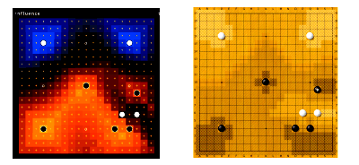
 Take this example of influence maps.
(note that there are five shades of beige in this diagram, and that therefore black has large influence at Tengen- the very darkest/lightest area's are "very strong influence" points and that simply is too speculative to be of any use, for Tengen).
In computer Go, the sub-problem of "influence" has been quite nicely solved by Bruno Bouzy, who has published several papers on his method.
Both Bouzy's and David Fotland's (of Many Faces of Go fame) influence functions "bounce" influence off the edges of the board and let the "wavefronts" combine. This is visible in the lower right corner of Moyo Go's example (right), but not in the "interactive Go map" on the left because a much simpler, more inaccurate algorithm is used that does not even take Manhattan distances into account. The purpose of Interactive Go maps appears to test and present Go-concept ideas in an esthetical manner, without laying claim to being "accurate".
And there are more things that are sub-optimal in the example on the left. Look at those white stones in the lower right. They project quite some influence leftward, but in the Interactive Go map there is nothing! Moyo Go's influence graph around Tengen is a large diamond, whereas in the Interactive Go MAps exapmple, it's a square. A diamond is the accurate form, because Go stones connect in a horizontal/vertical manner.
The analogy Go stones = magnets goes a long way, but in the end, Go stones in a Go position are not magnets and more realistic algorithms need to be employed to predict likely territory and influence, especially in more complex positions.
Let the Interactive Go maps be pretty, and let Moyo Go's influence maps be as accurate as possible. No effort has obviously been spared to make those maps as pleasing to the eye as possible, while I read my way through a pile of state-of-the art research in influence algorithms. The Bouzy algorithm remains unbeaten, but I found a way to greatly speed it up and get almost the same (or better?) results. Rest assured that although it doesn't look as good as the Interactive Go maps, no efforts have been spared to make them as useful as possible, and not merely good-looking.

<< Home