Competition Is Good
 The StoneBase ripoff debâcle made me realize that although I am a "leader" in the Go software world (there are more Go software "leaders", but none of them produces commercial software) , I have to constantly be aware of what the competition is doing. Go software is so complex that implementing the "major" things takes years, but "small" things can be done when the inspiration is there.
A while ago, SmartGo went out on a limb and purchased a lot of professional, custom-made glyphs. (SmartGo buys them, StoneBase steals them and I draw them by hand). It looks really expensive and professional (although a bit ugly and not so intuitive, in my opinion, but others complimented Anders on his new GUI so it might just be a matter of taste - it sure looks better than the previous one ;-).
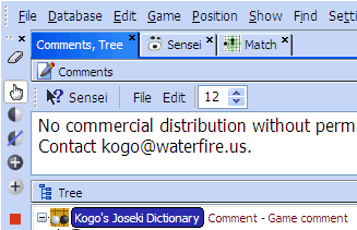
I wondered why my own glyphs looked a bit less fancy. I figured it had something to do with the background color. SmartGo's is light blue. When I got up today, I implemented a new way of handling themes. Instead of choosing theme names, you choose theme colors now, and much more of the user interface becomes "themed". See here the light blue theme. Looks great!
I always strive to reduce clutter, so I eliminated toolbar borders and -gradients.
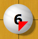
 The StoneBase guy drew my negative attention last week, so I decided to evaluate his software. It is clear that Moyo Go served as an example, and he actually said so. No harm in that, but I went looking for some improvement ideas. I found one: Moyo Go's old triangle annotation obscured the stone numbers. I liked the solution of using a small triangle in the lower right corner. Done.

<< Home