Publishing GUI Almost Done
 The GUI is the mirror to the soul of the application, so I often design, experiment and tweak for a very long time before I decide it's "done".
Everything is connected to everything else. With such a complex feature as publishing Go diagrams, it's a good idea to start with the GUI first, because it forces you to think about the nitty-gritty.
Moyo Go is designed with user-friendliness as the highest goal, and in my philosophy, minimalism is often best. Minimalism in the Apple-arian sense of the word (fewer widgets but more usability).
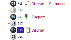
The diagram glyph informs the user about the diagram layout. Because it's nice to have markup with per-diagram granularity, but the resulting layout needs to be clear at a glance by looking at the tree as well.

<< Home